What To Include in a Movie Poster Design
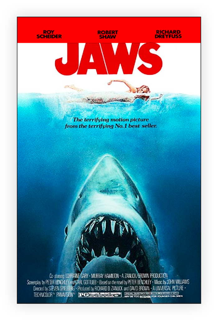
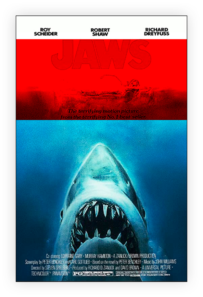
The anatomy of a standard Movie Poster Design.

Top Section
From the top, the movie poster usually starts with the actors’ names. But not in the order you might think. Actors’ names usually appear in the order of appearance in the film. For example:
The name of the actor who plays the main character is at the top. The second from the top would be the name of the actor playing the secondary character. And so on and so forth. This is because it’s easier for people to remember the first thing they see than the last. So if you’re designing a poster that shows all the characters, put their names in the same order as they appear in the film.
If there are two or more characters sharing the same role, then put the name of the character who appears first in the poster above the other one(s).
If the poster will show only one character, then put his/her name at the top.
If the poster will feature multiple characters, but none share the same role, then place them in alphabetical order.

Title Area
Next up usually comes the title. Choose your typeface wisely as you don’t want your audience to misunderstand the name of the film you are designing for. This is the most important element because it’s what people will see first when they look at your poster. Make sure you have a legible title that stands out from whichever image you decide to accompany it. If possible, use a font that has some personality and character that plays into the narrative of the movie.
The next thing you need to consider is how big or small you want your poster to be. A large poster can make an impact on audiences but it may not fit well into the frame of a store window. On the other hand, if you’re planning to hang posters all over town, then you’ll probably want something smaller than a billboard. The standard Hollywood movie poster size is approximately 27×40 inches (686×1016 mm). This is also known as a ‘One-Sheet’ size. I designed plenty of these while working at Sony Music.
The director’s name can often appear right above the title if the director is well known. Below is the title is fine too. If there is a tagline, it would normally go below the title. Taglines are short phrases that summarise the story of the movie. They are used to attract attention and help viewers understand the plot. Some examples of taglines are “It’s a Wonderful Life” and “I’m going to miss you.”

Credits Block
Below the title and tagline is where we have the credits block. It should contain the following information:
- Actor’s Name
- Role Played
- Director
- Writer
- Producer
- Cinematographer
- Editor
- Music Composer
- Sound Mixer
Make sure you get this info correct! You wouldn’t want to embarrass yourself by having your credit list wrong.
After the credits, you’ll find the logo of the studio that produced the film. Often there will be a few logos since a movie is made by many different studios.
Now that you’ve got all the basics down, let’s talk about the elements that make up a good poster design.
1) Colour Palette Colour palettes are very subjective. There isn’t a set rule for choosing colours. However, there are certain guidelines you should follow.
First off, choose colours that match the mood of the movie. For example, if the movie is dark, then stick with darker shades. If the movie is light-hearted, then pick brighter hues.
Second, try to avoid using too many colours. Too much colour can distract from the overall message of the poster.
Third, keep in mind that black and white is always better than colour. Black and white makes everything stand out. Plus, it looks more professional.
2) Typography Ideally, the typeface can follow the genre of the movie you are designing for. Sometimes this can however come across as cliché. So choose your fonts wisely.
3) Layout A good layout helps tell the story of the movie without being distracting. Try to create a clean, simple layout. Avoid busy layouts.
4) Art Direction Art direction is another way to add depth to your poster. Use interesting shapes and textures to draw attention to specific areas of the poster.
5) Composition Composition is the art of balancing the various elements of a poster. Make sure that the most important parts of the poster are highlighted. Also, don’t forget to balance the text against the background.
Movie posters have followed this standard design for years now ever since the first one was created back in 1927. Be sure to check out a few of my film poster designs in my portfolio section.

